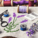
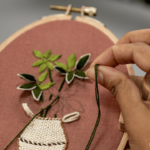
I have two border choices narrowed down for Jared. The version with the narrow cream inner border makes the top appear to float. But I’m not sure I like it better than just the purple and green border.
I’d love to hear from all of you which you prefer.
[…] Add the first border to Jared Takes a Wife. This will be the purple […]
LikeLike
I’m on board with the creme…I like the floating effect. Kris in OH
LikeLike
I’m wondering about putting the white border between the green and purple borders instead of right next to the blocks……What do you think about that? Very pretty colors and blocks! Nice job! Sally in SC
LikeLike
No White in the border….makes it too choppy just when you eye needs a break from all those pieces.
Happy Sewing,
great looking Jared :0)
LikeLike
Karen, I answered on the quiltvillechat list, but thought I’d comment here too. I prefer it WITH the cream — the green and purple don’t have a lot of contrast, and without the little bit of cream, your corner squares seem to melt into those dark borders. To my eye, anyhow. But you may like that effect, and since it’s your quilt … Ultimately you’ll have to decide what you like better. Nicely done!
LikeLike
I like the first option the best. The white sets it off best. Great quilt.
LikeLike
i like the second layout without the white narrow border in between
Leni B.NY
LikeLike
I know that many people have responded “no white” via Quiltville-Chat, however, with the white border, it really forces the center of the quilt to stand out. I like both layouts, but I know that statement doesn’t help you. I would use the 1″ white just to give it a more traditional look; making the center of the quilt and beautiful blocks dominate the quilt.
As we all always say though, ultimately, the choice is yours. Either way, it will be a beautiful quilt. You did a wonderful job!
LikeLike
I like just the purple and green borders. The only reason I can think of is because the cream seems to pull my eyes to the borders instead of looking at the blocks in the quilt.
LikeLike
I like it with the cream border. Sort of different
carolyn in sunny Paris/France
LikeLike
Karen, I love option #1 when the quilt appears to float. With the white contrast it’s seems more like a piece of art within a framed mat. Just my opinion, but wither way it is really pretty. I’ve always loved purple and green together and the red plays like a neutral. Nice Quilt.
JAne
LikeLike
I like the effect of floating shown in the first one. It makes it different, special. Good luck and congrats on finishing a beautiful project.
LikeLike